



Your fan opens the app two hours before kickoff, already thinking about the match, maybe looking for a lineup or a quick preview. So the question is simple: does your home screen even know a match is coming?
To find out, we opened four sports apps in the hours before a live event: F1, MotoGP, the FIFA World Cup 2026 app and MLB. Everything was captured on real devices and timestamped at several checkpoints on the way to kickoff.
Key findings in 60 seconds
- The apps are all well built. Where most fall down is getting every surface to agree that a match is coming.
- F1 and MotoGP run persistent, sponsor-branded countdowns. FIFA hides its countdown on the match page. MLB has none, and jumps straight to a warmup state at T-15 minutes.
- MotoGP's one-tap in-app reminder (15, 30 or 60 minutes, no calendar permission) is the single strongest pre-event pattern we found.
- FIFA runs a six-hour Live Blog no other app comes close to, then buries it below a home screen that never changes.
- The pushes that build the most anticipation, MotoGP's and F1's, both drop the fan on the wrong screen once they tap.
The gap we keep finding: apps that are excellent at live coverage, yet treat the hours before an event as dead air.
This is Episode 2 of UX Rerun, our feature-by-feature comparison of fan engagement in sports apps. Episode 1 looked at post-event engagement, what happens after the final whistle. This time we’re looking at everything that happens before it. We’re not ranking them. This is what we saw, plus what we’d build differently.
| Dimension | F1 | MotoGP | FIFA World Cup | MLB |
|---|---|---|---|---|
| Countdown timer | Persistent, TAG Heuer-branded, from T-1h20m | Tissot-branded on hero card | Match page only, static on home | None; warmup flip at T-15m |
| Home screen transforms | Two shifts, dead zone between | Best state machine, editorial lags | Never changes | Single binary switch |
| Pre-event content | 7-slide previews + real-time stories | Live Blog dark for ~4 hours | 6-hour Live Blog, one container | Richest Game Story, feed backwards-looking |
| Push notification | Countdown push, wrong deep link | Two pushes, no deep link, silent at lights-out | Lineup drop pushed at T-90m | Named pitchers, but lineup push never fires |
Does your home screen know a match is coming?
The simplest pre-event mechanic is a countdown: tell the fan how long until the thing they care about starts. Two apps in our set do it well, and two don’t do it at all.
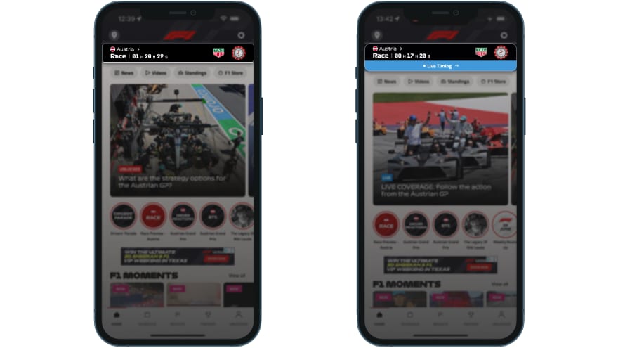
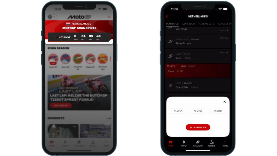
F1 runs a persistent countdown on the home screen session bar (Race | 01H 20M 29S) from at least T-1h20m, branded by TAG Heuer. MotoGP does the same with a Tissot-branded countdown on its hero card, and adds something clever on top: an in-app reminder where you tap a ⊕ icon on any session and pick 15, 30 or 60 minutes.
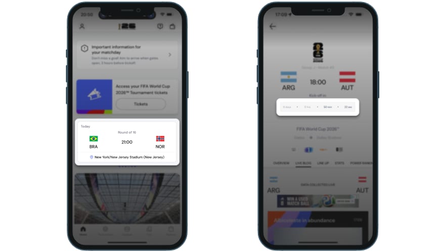
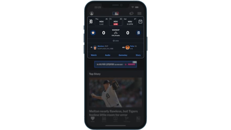
The other two never build that urgency. FIFA has a countdown, but only on the match detail page, so its home carousel shows the same static kickoff time at T-2 hours as it does at T-10 minutes. A fan who doesn’t tap into the match gets no signal at all. MLB shows nothing until roughly T-15 minutes, when five things change at once: a LIVE pill appears, the score activates, and Watch and Audio links replace Tickets. No progressive build, just one binary switch.
A countdown is only the surface. The real question is whether the home screen itself changes as kickoff nears, and here even the strong apps stumble.
F1’s session bar flips at T-1h30m. Then it freezes for 40 minutes, until a Live Timing banner finally appears at T-12m. MotoGP does better up top: its hero rolls through four automated states as the race approaches. The trouble sits just below it. Twenty-seven minutes before the Grand Prix, that editorial card was still running a lifestyle feature (“UNHEARD: IT’S NEVER BEEN THIS HOT IN ASSEN”), even though the hero already had the race flagged. So the automated part of the screen knows the race is coming, while the editorial part hasn’t caught up. FIFA has neither problem, because its home screen simply never changes: it looks the same at T-24h, T-2h and T-10m.
Who fills the anticipation window with content?
The hours before an event are when fans are most receptive. They’re checking in, wanting to feel the match approaching. Some apps fill that window, and others leave it empty.
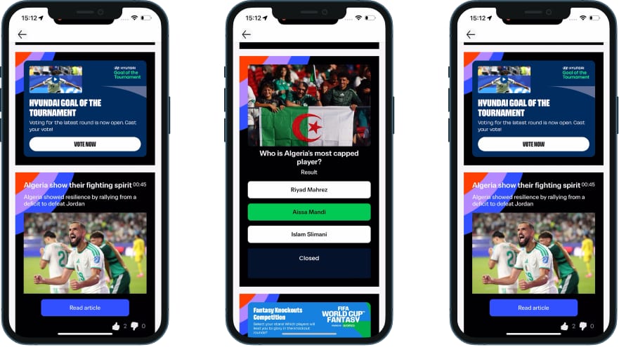
FIFA runs the most sustained pre-event editorial in our set. Its six-hour Live Blog carries roughly 50 to 60 entries that build from tournament context through previews and press conferences into lineup drops, warm-up photos and a final countdown, with polls, quizzes and a prediction dial inline. It’s impressive in scale. The catch is that the Live Blog is the only pre-match container, so a fan who doesn’t scroll it misses the entire effort. And roughly 20% of those entries are commercial content (merchandise, tickets, hospitality) blended in with no visual distinction from the editorial.
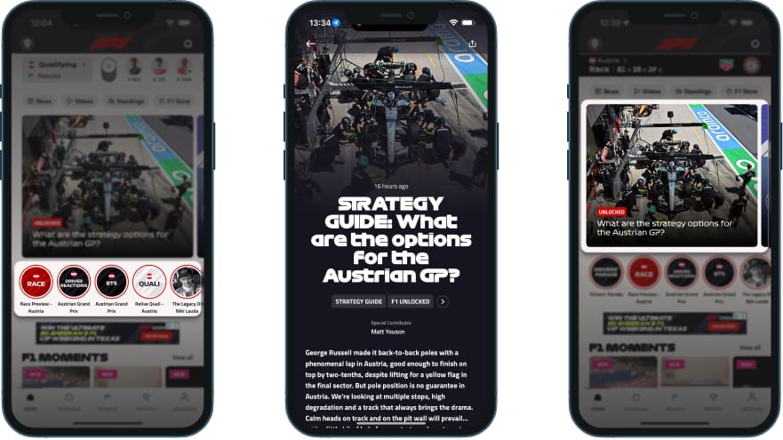
F1 takes a different shape and spreads its depth across surfaces. Its Story rail delivers a seven-slide qualifying preview, plus a Drivers’ Parade story with interviews published within an hour of filming. The real depth play is the Strategy Guide, pushed Saturday evening with Pirelli pit-stop simulations and race-pace data down to hundredths of a second. It’s the richest analytical content in the set. Even so, the hero card showed that same paywalled guide for 2 hours and 35 minutes on race day, static, while the stories and session bar did all the work around it.
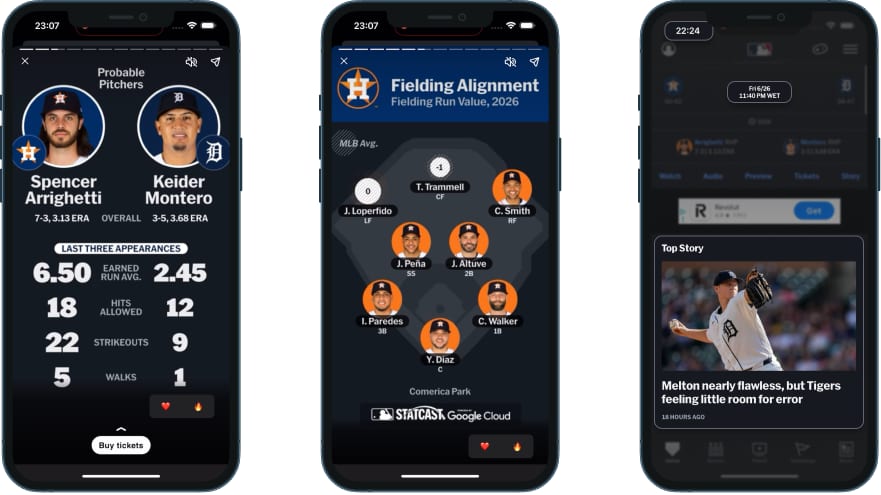
MLB then offers the single richest pre-event surface we tested, but hides it. Its Game Story packs about eight swipeable cards:
- Probable pitchers compared by their last three starts, not just season averages
- Bullpen availability with colour-coded recency bars
- Statcast fielding alignment on a diamond diagram
- A Player of the Game teaser that says voting opens “after the 6th inning”
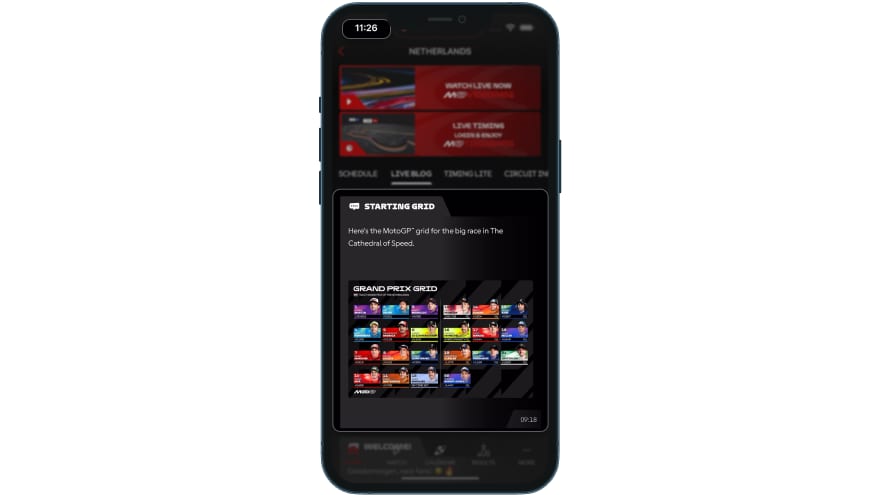
It’s the only surface in the set that primes engagement during the game. Yet at T-76 minutes the home screen feed was still backwards-looking, its top story 18 hours old. MotoGP has the opposite problem: its Live Blog went dark for nearly four hours, its last pre-race post landing at 09:18 for a 13:00 start. Peak anticipation, zero content.
The push that builds anticipation (and where it lands)
A pre-event push has one job: get the fan into the app at the right moment. The good ones add a little context and send the fan somewhere useful. The others just open the app.
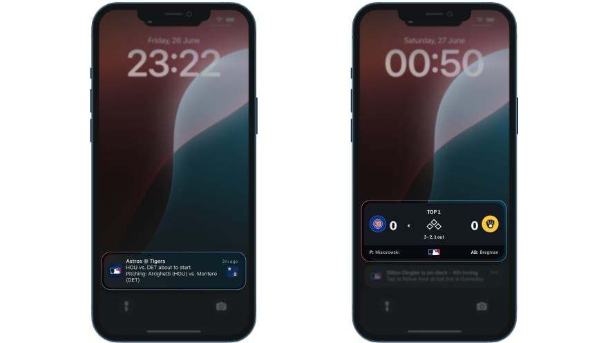
MLB’s game-start push does the job cleanly. It fires about 18 minutes before first pitch, names both probable pitchers (“Tigers vs. Astros about to start. Pitching: Montero vs. Arrighetti”), and stays scoped to followed teams with almost no generic leakage. Its On-Deck alert, pushed when a followed player is next to bat, is the most granular real-time notification in the set. No other app scopes a push that tightly.
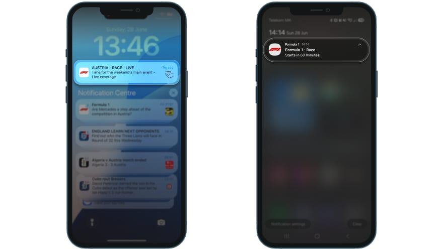
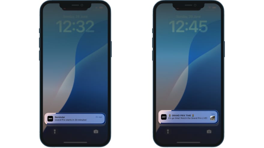
F1 sends session-start pushes for every session type and a race countdown at T-60m. MotoGP sends one editorial push at T-15m by default, and if the fan set a reminder themselves, a second one fires at T-30m. Neither deep-links to race content, so the fan opens the app and has to find the race alone. Worse, nothing fires at lights-out, so the sequence builds anticipation then goes silent at the exact moment fans most need a signal.
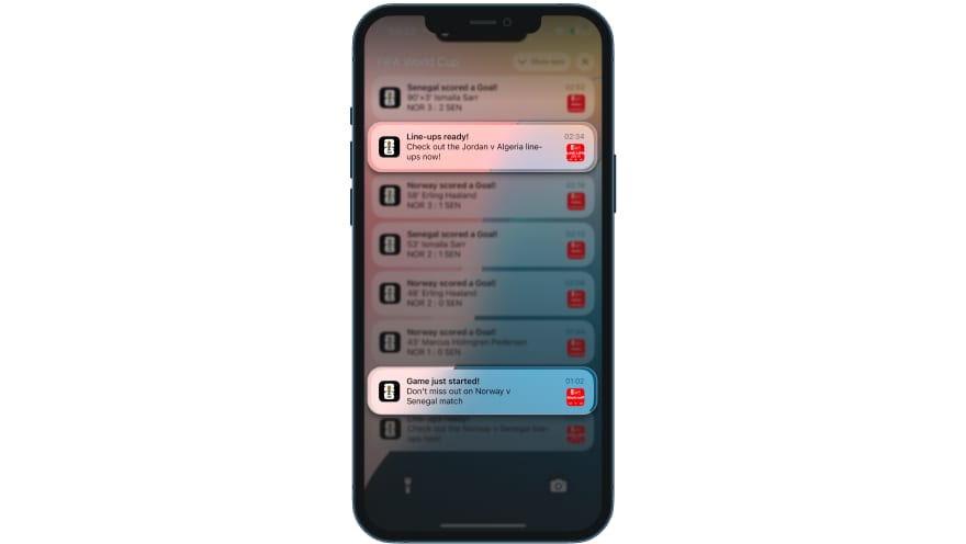
FIFA handles one moment better than anyone. It pushes the lineup at T-90 minutes with a branded “LINE-UPS ARE IN” badge, the only app in the set to treat the lineup drop as push-worthy. MLB, by contrast, has a Starting Lineups toggle that stayed on throughout our captures and never once fired.
What this tells us
The pattern from Episode 1 repeats here, only from the other direction. Post-event, the question was whether the app knows the match just ended. Pre-event, it’s whether the app knows a match is about to start. And in both cases, the winners aren’t the ones with the most features. They’re the ones whose surfaces agree.
Look at each app on its own and the same shape shows up every time:
- MotoGP has the best state machine and the strongest single idea in that one-tap reminder. But its editorial layer never shifts, its Live Blog goes dark for four hours, and its pushes open the app to nowhere in particular.
- FIFA runs a six-hour operation nobody else matches, then leaves it inside one container on a home screen that never moves.
- F1 has the deepest analysis and the best real-time editorial, yet its hero sits static for nearly three hours and its push lands on the wrong page.
- MLB packs more useful pre-game analysis into eight cards than most apps manage anywhere, yet its home screen ignores the game until the warmup flip, and the lineup push that should exist never fires.
Every app here has at least one pre-event feature better than anything the others offer. None of them have connected those features into a single experience that builds from T-24h to kickoff.
So the features are all there. What’s missing is the wiring between them. You get a countdown ticking away while the feed still shows yesterday’s news, or a push that builds urgency and then dumps the fan on the wrong screen.
This is where it matters for anyone building a sports app, because the pre-event window is what earns you the right to send a “watch now” notification. A fan who’s had useful content and rising urgency for two hours will tap it. A fan who’s seen the same screen all day might not even notice. So if we were building this from scratch, we’d start where we started post-event: one shared event-state layer that every surface reads from, synced to the same clock. Get that in place first, and the countdown, the feed and the push finally tell the fan the same story.
How does your app compare?
Score your pre-event experience against what we found:
This is Episode 2 of 6. The complete UX Rerun Season 1 analysis compiles into the Fan Engagement Benchmark — a cross-platform scoring framework covering post-event, pre-match, personalisation, gamification, catch-up, and social sharing. Phase 1 (Episodes 1–4) drops July 21, 2026.
Fan Engagement Benchmark