The match just ended. Your fan has their phone out, still buzzing from what happened, looking for the replay, the stats, something to send the group chat. What does your app do with that moment?
We opened four sports apps right after a live event to find out.
The best app in our set didn’t win on features. It won because every surface knew the event was over at the same time.
The FIFA World Cup 2026 app across several Round of 32 matches. The F1 app after the Austrian Grand Prix. MotoGP after the Dutch TT at Assen. And the MLB app across multiple games during a regular-season week. All captures were on real devices, manually timestamped from the moment the event ended through the following morning.
Key findings in 60 seconds
- The apps don't separate on feature quality. They separate on whether every surface agrees the event just ended, and MLB holds that line best.
- F1 has the result on screen within seconds of the chequered flag, no taps needed. MotoGP's home screen sat in "FOLLOW LIVE" for 37 to 46 minutes after the race was over.
- MLB's push did the work for you: winning pitcher, losing pitcher, innings, earned runs, strikeouts, walks, all on the lock screen. MotoGP's landed 59 minutes late and still didn't name the winner.
- FIFA had bylined editorial live 22 minutes after full time. MotoGP had the reporting too, then sent every clip off to X to actually watch it.
- Here's the one that stings: MotoGP's Stories handle watched-state better than any app we tested. Almost nobody finds out, because the home screen and the push timing are broken.
The gap between the best and worst post-event experiences comes down to one thing: whether the app treats “event just ended” as a product state that gets designed for, or as a moment that happens and fades into a generic home screen.
This is the first episode of UX Rerun, our feature-by-feature analysis of UX in major sports apps. Season 1 covers fan engagement across six episodes: post-event experience, pre-match build-up, personalisation, gamification, catch-up and spoiler management, and social sharing. Future seasons will get into discovery, live event experience, and monetisation. Each episode takes one subtopic and compares how different platforms handle it. No rankings, no awards. Just what we found and what we’d build differently.
| Dimension | F1 | MLB | FIFA World Cup | MotoGP |
|---|---|---|---|---|
| Home screen update speed | Seconds | Seconds | ~30 min, moved behind next fixture | 37–46 min stuck on FOLLOW LIVE |
| Push notification quality | Teaser copy, no winner named | Full stat line within 8 min | Score at exact full time | 59 min delay, winner withheld |
| Post-event content hub | Strong content, scattered across surfaces | Dense Wrap tab, 9 modules in one scroll | Live Blog continuity, progressive content | Fast editorial, all video routed to X |
| Data & analysis depth | Power Rankings, lap data, sector splits | Statcast visualisations auto-generated | Aramco Power Rankings, sortable table | No equivalent surface observed |
| Bridge to next event | Session bar flips at T+2.5h, aggressive | Next-game hooks during current game | Bracket card at T+12 min, RELATED MATCHES tab | One editorial line at T+70 min, structural hook days later |
| Stories / catch-up format | 40-clip live Story, deleted once watched | Game Story, no watched-state marker | Live narrative arc, moves to end of rail when watched | Best watched-state handling in the set |
When the app knows the game is over
The first thing a fan sees after the final whistle is the home screen. Does it reflect what just happened?
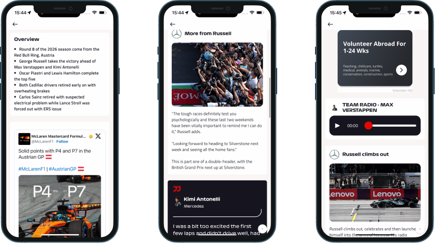
F1 was the fastest in our set. Open the app after the Austrian Grand Prix and the session bar already reads “Race > Finished” with a chequered flag. The driver strip shows P1 Russell, P2 Verstappen, P3 Antonelli, P4 Piastri, with a small star marking the drivers you follow so you can spot your favourite’s finish at a glance. Below the strip, a tappable editorial card links to the full race report: “Russell seals thrilling Austria victory from Verstappen.” Zero taps from lock screen to result. One tap to the deep analysis. The data layer updated within seconds of the chequered flag; the editorial headline caught up within about 30 minutes. Two different systems running at two different speeds, but the result was visible immediately.
MLB handled the transition differently but just as cleanly, and it happens in two moves. The instant the last out is recorded, the matchup header flips from a LIVE pill to a FINAL pill, and the Gameday pitch tracker freezes on the final play (in our capture, a called swinging strikeout, pitch location grid and play description still on screen). At this stage the tab row hasn’t moved: Watch, Audio, Gameday and Story are all still there. A few minutes later, the whole card rebuilds into a post-game summary and the tabs swap to Wrap, Box, Videos and Story (more on that in the content hub section below). Think of it as an instant freeze-frame first, then a fuller rebuild. A fan checking the score in the first thirty seconds and a fan opening the app ten minutes later both get a clear “this is over” signal, just at different levels of depth.
The FIFA World Cup 2026 app moved the completed match card behind the next fixture within 30 minutes, a clean editorial choice. But a stadium-arrival banner (“Important information for your matchday: aim to arrive when gates open”) sat in the top home screen slot throughout our whole capture window: during the match, right after full time, and still there the next morning. Someone opening the app at breakfast still saw an arrival-time notice for a match that had finished hours ago.
MotoGP’s home screen stayed in “FOLLOW LIVE” state for 37 to 46 minutes after the race ended. The hero never transitioned to show the winner across our entire 18-hour capture window. Instead, the editorial team led with the Bezzecchi crash story. Meanwhile, the LIVE badge and a “FINISHED” label appeared side by side on the same screen, a state-sync issue that makes the home screen feel like nobody’s watching it.
MotoGP isn’t behind. It’s uneven. It does the hardest part well and an easy part badly.
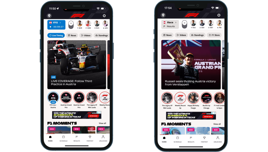
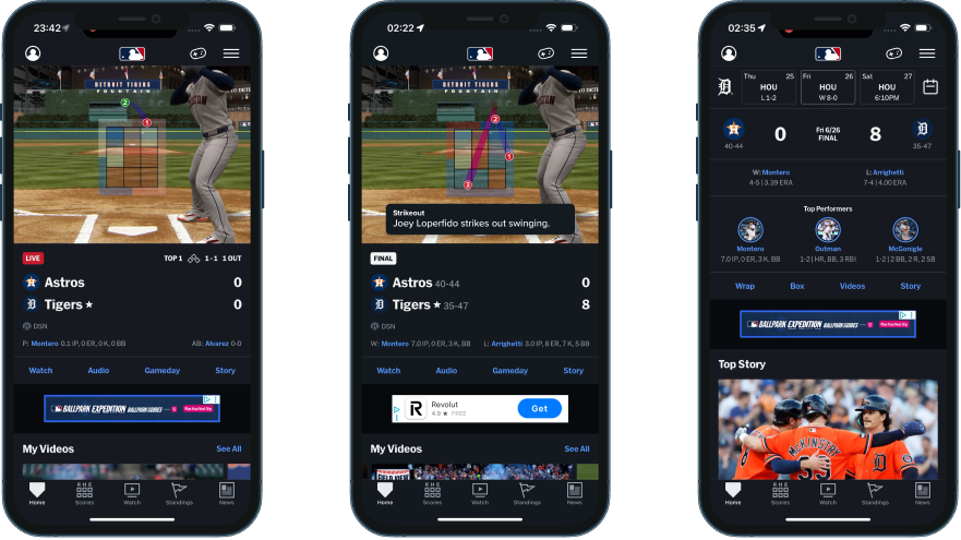
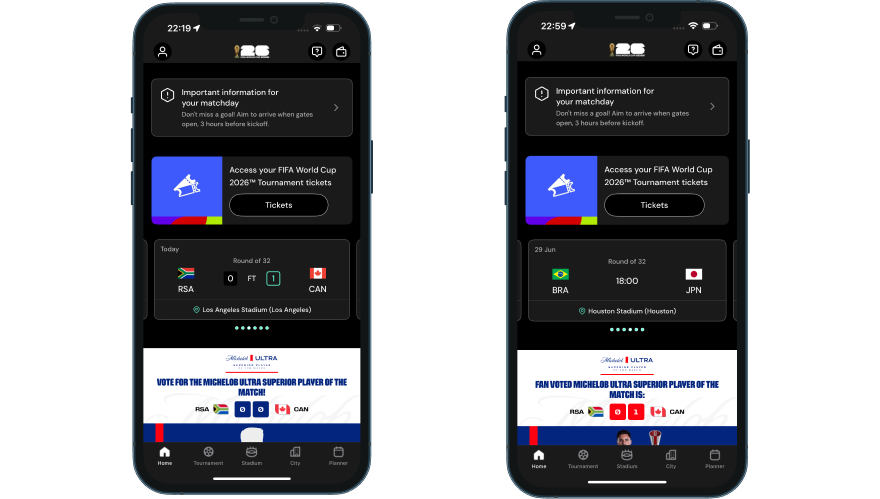
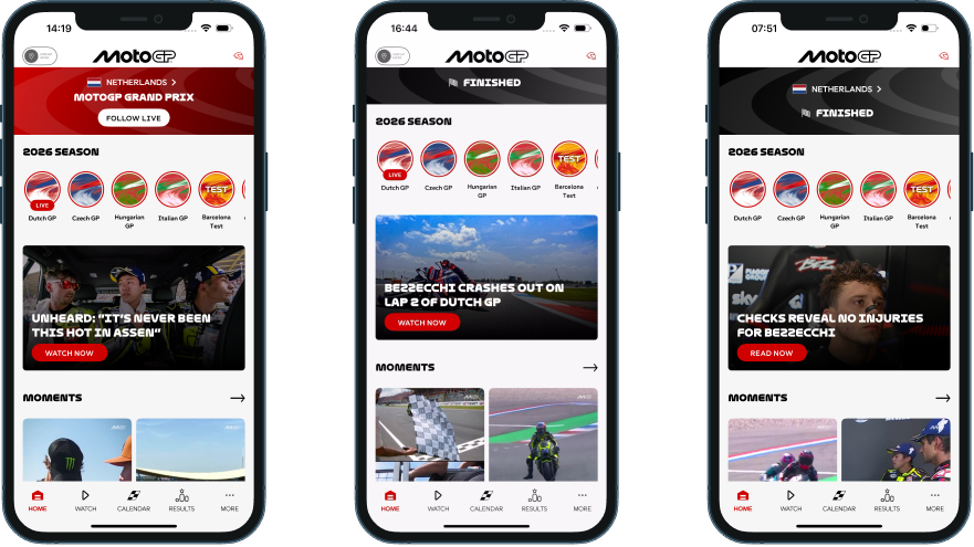
The home screen is the most-visited surface in any app. When it doesn’t reflect reality, fans trust it less. They learn, over a few events, that this isn’t the place to go first. And once a fan forms that habit, it’s hard to undo.
The notification that earns its open
A push notification after the final whistle is the simplest re-engagement mechanic in sports. What matters is what it says and when it lands.
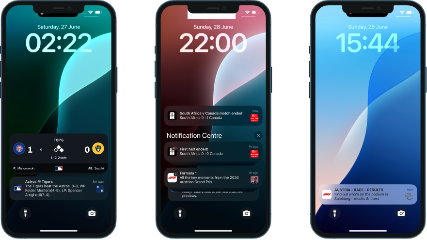
MLB’s game-end push contained the full stat line: “The Tigers beat the Astros, 8-0. WP: Keider Montero (4-5), LP: Spencer Arrighetti (7-4).” Winning pitcher, losing pitcher, innings pitched, earned runs, strikeouts, walks. You didn’t even need to open the app. The complete result was right there on the lock screen, within minutes of the final out.
The FIFA World Cup app sent its push at the exact moment of full time: “South Africa v Canada match ended, South Africa 0 : 1 Canada,” with a branded score card thumbnail. It arrived the instant the game ended and told you the actual score. No teaser copy to decode.
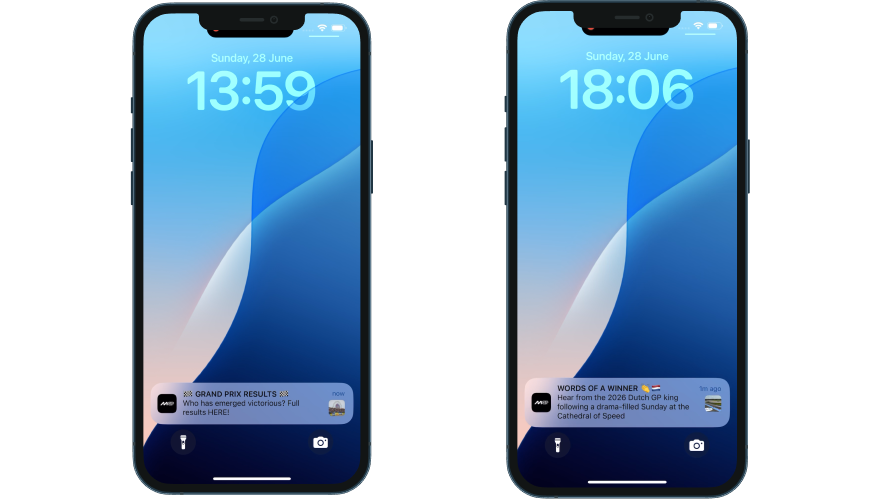
F1 took a different approach. The first push at T+6 minutes read: “Find out who’s on the podium in Spielberg.” No winner named. We had spoiler-free mode switched on in Settings ahead of the race, so we can’t yet say whether this is F1’s standard podium push or copy that gets personalised when that setting is on; that needs a control test with the setting off. A second push at T+4 hours linked to a depth article. Two beats: one for the result seekers, one for the analysis seekers. Either way, the two-wave architecture is the interesting pattern here, and if spoiler-free really does change push copy, that’s worth its own callout in the Ep 5 catch-up and spoiler episode.
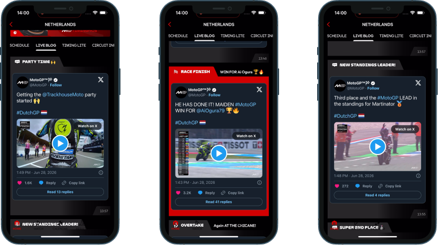
MotoGP’s result push arrived at T+59 minutes: “Who has emerged victorious? Full results HERE!” The mystery framing deliberately withheld the winner’s name to drive a tap. A second push at T+266 minutes, headlined “WORDS OF A WINNER,” still didn’t name Ai Ogura.
For anyone who finished the race and picked up their phone an hour later, the official app hadn’t yet told them who won.
One operational detail worth flagging: MotoGP’s result push correctly deep-linked to the Results tab, but the tab defaulted to Warm-Up session data, not the race classification. The routing worked. The session filter didn’t. So tapping “Full results HERE” landed you on the right screen showing the wrong results.
When each app communicated the result — minutes after event end
Hover any dot for details. Scale is segmented: T+0–30m, T+30m–2h, T+2h–5h, T+5h–18h+.
The post-event content hub
This is where session time lives or dies. The notification gets the fan back into the app. What’s waiting for them determines whether they stick around for 30 seconds or 10 minutes.
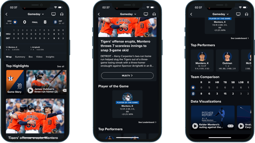
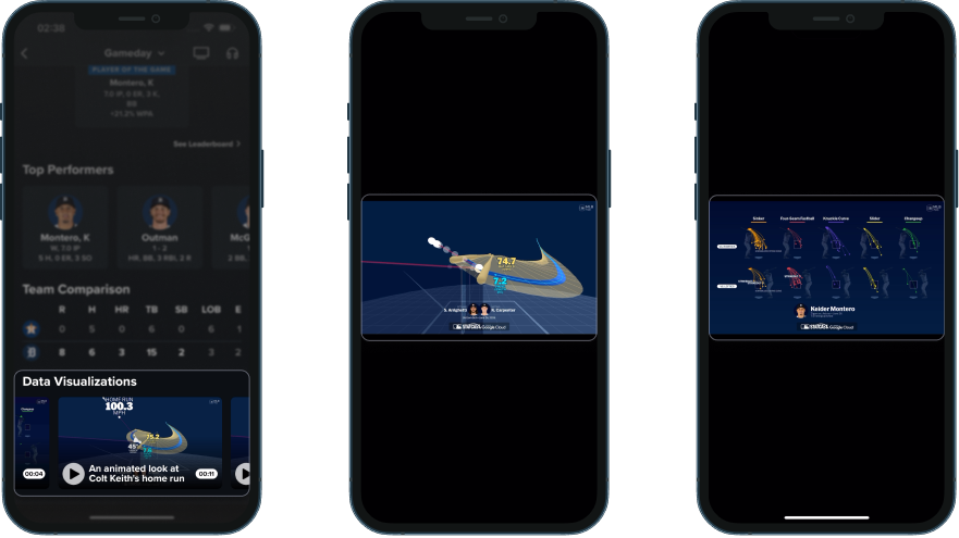
MLB’s Gameday screen, the same one that froze on the final pitch the moment the game ended, transitions from a “Live” subtab to a “Wrap” subtab within about 8 minutes of the final out. The Wrap tab packs nine content modules into a single scroll: line score, winning and losing pitchers, a highlights rail, a full-width editorial photo with headline, an MLB.TV replay CTA, Player of the Game with win probability as the metric, Top Performers with detailed stat lines, a team comparison table, and Statcast data visualisation clips. Dense. Arguably too dense for one scroll. But every module earns its place, and a fan can stop scrolling at any point having already consumed something useful.
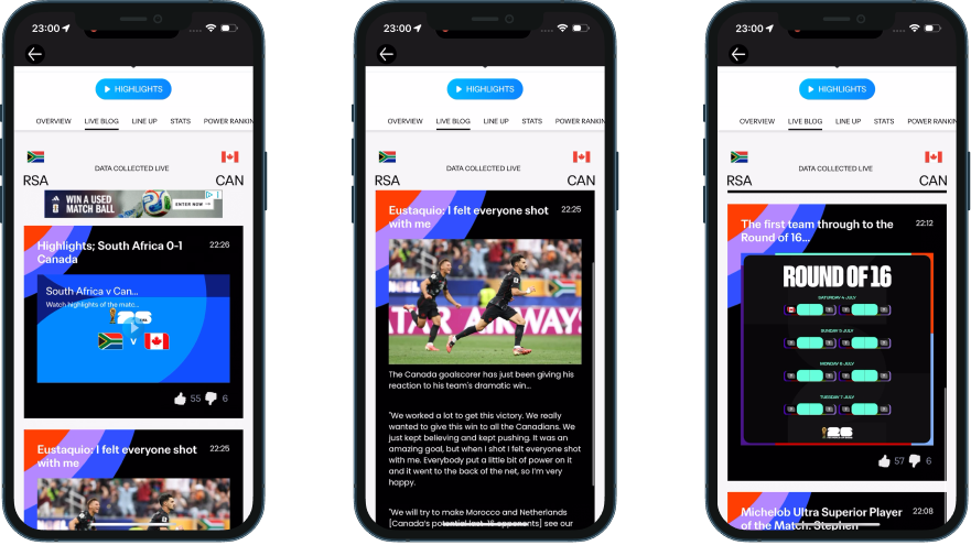
The FIFA World Cup app went with a continuity approach. The Live Blog, the same surface fans were using during the match, transitions into a post-match editorial feed. Content populates progressively over about 90 minutes: match highlights at T+26, interview quotes at T+25, articles at T+22 on the News tab, POTM voting result at T+8, and PlayZone trivia games arriving around T+90. The fan doesn’t have to navigate anywhere new. And the editorial velocity was impressive: proper bylined journalism with narrative headlines, not automated result cards, within 22 minutes of full time.
F1’s post-race content spread across multiple surfaces. The Lap by Lap feed introduced driver quote cards within minutes of the chequered flag: first-person reactions from podium drivers. Team radio clips played inline with no paywall, which feels notably generous given that team radio is F1’s strongest exclusive content. F1 Moments, the app’s short-form vertical video shelf, refreshed with NEW-badged clips within 90 minutes. The content itself is strong, but it lives across several tabs and surfaces. A fan has to already know where to look.
MotoGP’s Live Blog delivered the fastest winner identification in any app we tested: Ai Ogura named within 3 to 6 minutes, followed by six labelled celebration sections covering the full podium and championship implications within 7 minutes. The editorial narrative was rapid and well-structured. But every race video in the feed was an X/Twitter embed with “Watch on X” CTAs. The app surfaced the signal, then sent every fan to someone else’s platform to actually watch it.
How highlights and stories serve catch-up fans
Post-event catch-up content comes in three formats across our set, and they’re worth naming properly before comparing platforms. Horizontal highlights are the traditional widescreen clip, watched full-screen. Stories are the Instagram/Snapchat-style format: vertical slides you tap left or right to move through, usually pinned to a circle or card on the home screen. Short-form vertical video (Reels or Shorts-style) is the swipe-up/down feed of standalone vertical clips. Not every platform uses all three.
| Platform | Horizontal highlights | Stories (tap left/right) | Short-form vertical video (swipe up/down) |
|---|---|---|---|
| MLB | Play clips live during the game; full package and condensed game auto-advance by the next morning | Game Story: video plus info card, per-slide reactions, no auto-advance, no watched-state marker | Not offered |
| FIFA World Cup | Live Blog embed first, then the Tournament Highlights tab, then an on-page pill button | Full match narrative arc published live as each moment happens (Starting XI, kickoff, halftime, goals, full-time), persistent CTA, moves to end of rail once watched | Not observed as a distinct format from Stories |
| F1 | "2026 Highlights" home shelf, auto-advancing Related queue | Race Live - Austria: updates live during the race (~40 clips), loses its LIVE badge and gets renamed Relive Race - Austria after; auto-advances, deleted once watched | F1 Moments, refreshed within 90 minutes post-race |
| MotoGP | Dedicated Highlights shelf, manually-tapped Related list | Dutch GP story circle: continuously updated across the whole race weekend (practice, a crash, rider interviews, Sprint grid and results, breaking injury news), stays in place with a grey overlay once watched | Moments, carries the real post-race racing content |
The table captures the format mix, but the more interesting comparison is what happens after you’ve watched a Story. F1 removes it from the rail entirely. The FIFA World Cup app keeps it, moved to the end. MotoGP marks it watched in place with a grey overlay. MLB doesn’t mark it at all, no repositioning, no visual change.
MotoGP’s version is closest to what we’d build. The pull of a fresh, un-greyed circle stays intact as a reason to come back quickly, but nobody gets locked out of a recap just because they watched it once.
The full per-platform breakdown of format behaviour, live-update mechanics, and content depth is covered in the Fan Engagement Benchmark when it drops in August.
Data that explains what happened
Knowing who won is the baseline. What fans really want to understand is why and how it happened, and three platforms in our set actually go there.
MLB’s Statcast visualisations are auto-generated for every game. The Wrap tab includes animated pitch movement charts, velocity scatter plots, bat contact analysis with sweetspot position, bat speed, launch angle, and exit velocity data. They’re branded (“MLB STATCAST powered by Google Cloud”) and include an AirPlay button for TV casting. For someone who missed the game, these clips explain the moments that mattered in a way the box score can’t.
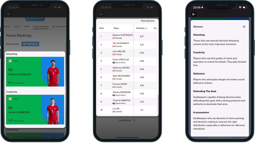
The FIFA World Cup app introduced Aramco-branded Power Rankings about two hours after full time. Three hero cards (Attacking, Creativity, Defending) with player ratings and a sortable table of all players. Tapping a column header re-sorts the rows correctly, a small detail that makes the table feel like a real tool rather than decoration.
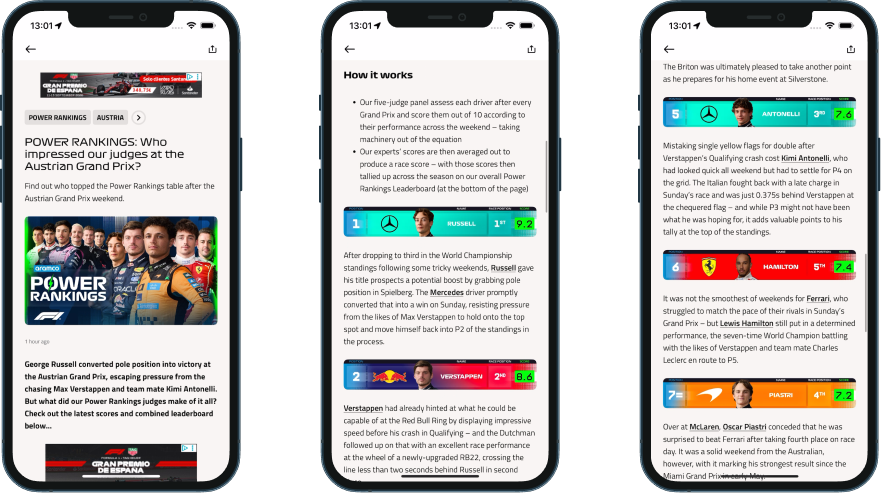
F1 has extensive session data at the timing screen level (lap times, sector splits, tyre strategy), but Power Rankings live on a separate surface. And they turn out to be better presented than we first expected. The feature arrives as a push notification (“Who impressed our judges at the Austrian Grand Prix?”) that opens into a full article: a “How it works” explainer up top explaining that a five-judge panel scores every driver out of 10 across the weekend with machinery factored out, then a driver-by-driver breakdown with colour-coded position bars, team livery, headshots, race position, and score in a green badge. Each driver gets a paragraph of real analysis, plus there’s a “Missing out” section for those just outside the top 10. Only the season-aggregate leaderboard at the bottom condenses into a dense table, and even that carries colour coding and change arrows.
Bridging to the next event
Showing what happened is one thing. The apps that hold attention longest also give you a reason to come back.
The FIFA World Cup app did this best. At T+12 minutes, a Round of 16 bracket card appeared in the Live Blog (57 likes). At T+19, an editorial card announced Canada’s next match date. A previously undocumented RELATED MATCHES tab on the match page embedded the tournament schedule right inside the completed match view. All of this while the emotion from the current match was still fresh.
MLB planted next-game hooks before the current game had even ended. A followed player’s card showed “Next Game: Sat 6/27 6:10 PM vs. Astros” during the 7th inning. When you play 162 games in six months, there’s always a next event, and the app uses that rhythm.
F1’s session bar flipped to the British Grand Prix at T+2.5 hours, removing the Austrian GP result from one-tap access. The Relive Race story’s final slide contains a British GP card, but only fans who watch all 40 slides see it. The handoff feels aggressive. A fan catching up on Sunday evening finds the app has already moved on.
MotoGP’s Live Blog included one forward-looking line at T+70 minutes: “full focus turns to Round 11… Next stop: Sachsenring.” Good copy, but nothing structural backed it up in the following hours. The structural version does arrive eventually: a few days later, the home screen hero flips entirely to the next round, “Germany > MotoGP Gearup,” with a Tissot-branded countdown running in days, hours, minutes, and seconds. A real next-event hook, just a much slower one. F1’s session bar turns over at T+2.5 hours. MLB surfaces the next game before the current one ends. The FIFA World Cup app has a bracket card live within 12 minutes. MotoGP gets there in days.
What this tells us
None of the strongest post-event experiences we tested got everything right. What they got right was architecture: every surface in the app tied to the same understanding of what state the event is in, updating together instead of on separate schedules. MLB comes closest to holding that line. The same event-lifecycle logic runs through its pill states, its push, its Wrap tab, and its sharing assets. No surface gets caught out of step with the others.
MotoGP is the clearest example of what happens when that consistency breaks down inside a single app. Its home screen sat in a “FOLLOW LIVE” hero for the better part of an hour after the race ended, at one point showing a LIVE badge and a FINISHED label side by side. Its result push routed correctly to the Results tab, then showed the wrong session once it got there. And yet its Stories format has the best watched-state handling in our entire set. A story stays exactly where you left it, greyed out but still reachable, while F1 deletes the equivalent the moment you’ve watched it.
The FIFA World Cup app runs a similar contradiction in the opposite direction. Its Live Blog transitions from live coverage into post-match editorial within minutes, and its Stories publish live as each moment happens, one of the strongest continuity mechanics we tested. But that Live Blog sits below a stadium-arrival banner that never once acknowledges the match has ended. That banner slot was never built to know what state the event is in.
F1 comes closest to a fully connected picture: a zero-tap result, Power Rankings that are a real article rather than a bare table, a race Story that updates live and relabels itself the instant the chequered flag falls. Its one gap is the mirror of MotoGP’s strength: once you’ve watched that Story, it’s gone.
Consistency, not quality, is the real variable. Every one of these apps builds good individual features. What separates them is whether those features are still talking to each other by the time a fan opens the app again.
That gap tells you more about how mature each organisation’s digital operation is than any feature list ever will.
How does your app compare?
Score your post-event experience against what we found.
We build these systems. If you want to talk through what a post-event architecture looks like for your platform, get in touch.
This is Episode 1 of 6. The complete UX Rerun Season 1 analysis compiles into the Fan Engagement Benchmark — a cross-platform scoring framework covering post-event, pre-match, personalisation, gamification, catch-up, and social sharing. It drops in August 2026.
Fan Engagement Benchmark